5.31.2012

The Writer

 These custom stamps and calligraphy by Molly Jacques are right up my alley. And for a more casual approach, how 'bout that Hola Amigo! stamp up there?


5.30.2012

Alexander Kent


I'm really digging these still-lifes by Alexander Kent. There's so much thought put into the clean, clever styling. And that's the trick, isn't it? At least for me; I'm easily won over by a little humor and some negative space.


5.29.2012

Stamberg Aferiat House

The Stamberg Aferiat house in Shelter Island, NY is not for the faint of heart, and definitely not for those with a fear of color. How could your mood be anything but sunny staying in a place like this?


5.25.2012

Weekender

Like a creepy little laptop monkey...


Have a great weekend! Here's some links:

- That one time when I wished I was an Indian camel.

- Must try this.

- I clicked, clicked, clicked away.

- Have a seat, kiddo.

- Gorgeous.

- Snow White and...Sherlock Holmes?

- Someday.

Pink Friday

Image via the iPlate series by Todd Borka. Not gonna lie, there have been times when I've been on Photoshop for so long, that afterwards, in life outside the computer, when something bad happened, my left hand instinctively shot up to hit a phantom command + Z. Major cray. That's when you know to step away for a little bit. Happy Pink Friday!

5.24.2012

Tablescape

I love all the modern furniture at The Conran Shop, but I especially enjoy the tables, desks, and consoles. And because you have options...
1 / 2 / 3 / 4 / 5 / 6

5.23.2012

Whoa


This is a snippet from graphic designer, Tom Jaeger's identity set. The gif above is (and I don't often use this word to describe gifs) pretty badass. 

(discovered // GE)

Try a little softness

 Many Pink Friday's ago, I posted this work by Beata Wilczek, and now I'm blogging about her collages again. They're simple, gorgeous, and I love them. It's been many moons since a collage graced the pages of this mixed-media-loving blog. (images via Beata's Flickr)


5.22.2012

Ornithology

Have I told you about my irrational fear of dead birds? What would you call that phobia? There's something about the blank expression in death, of something so regal, with the power of flight, that just freaks me out. To be honest, I think it's the open beak that gets me. I could really get into this topic, but I digress. Don't worry, there are no dead birds in this post about Audrey Corregan's bird-centric photography series, Obviously. But maybe I was getting somewhere with the whole faces conversation: even with their backs turned to camera, they have such a power. A quiet defiance deserving of my fear.

(discovered here)

5.21.2012

Sofia

I love this branding done by Mexico branding agency, Anagrama, for Sofia, a residential/corporate building in San Pedro, Mexico designed by internationally renowned architect Cesar Pelli. With its little touches of gold, but overall sparse graphic design, its got that whole "minimal luxe" look down.


5.18.2012

Weekender


I am cupcake'd (Sprinkles) out from my trip to the city. Salty caramel, I'll never forgive myself for only buying one of you. On my way, I took a bunch of pics; I had completely forgotten what sun looks like in the city. I love the signage of The Allerton, and I don't know how I missed it all this time. Note to self: look up next time!

Happy Weekend! Some links:

- You're waiting for a train......er, uh, in a train.

- A thousand times, "YES!" for this solution to less than sanitary soda cans.

- I know a dog (ahem, Louie) who would love this modern cave bed.

- I could get on board with this sweet and savory treat.

- Such an inspiring, beautiful place.

- Where to stay in Brooklyn.

Pink Friday

It's that time of year when things around here slow down from time to time. Let's relax, and enjoy the season, shall we? (image via *Nishe)

5.17.2012

MSGM


I was so drawn to these looks from MSGM's Pre-Fall 2012 lookbook, but not for the reason you'd think. Yes the clothes are really cool, but I can't quite get over how amazing all this print looks standing in front of a grey wall and atop a contrasting, bold, printed floor. I'd love to be able to incorporate a similar graphic accent into my space one day. (image source: Your Mother Should Know)


5.16.2012

CMYK


Graphic designers and printers will be very familiar with this. It's called a rosette, and it's the pattern in which inks are arranged when printed using a traditional offset printer. Take a close (really close) look at a page in any magazine, and you'll see that the colors aren't actually solid. They're tiny dots of cyan, magenta, yellow, and black inks, each color arranged at a specific angle and varying sizes to create the illusion of a continuous tone. You can pretty much print every color from just these four (there are exceptions). But nix the inks and replace them with thread and you've got these works, called CMYK embroidery, from Evelin Kasikov. Check them out:

(discovered via Anthology)


And here's Evelin's stitched artist profile for when she worked on a commissioned piece for Kate Spade's Year of Color.:


5.15.2012

Sunless Tan

I know summer is all about bright, and neon, and sun (and believe me, I indulge in all that), but there's something about neutrals that counterintuitively stands out on the sunniest of days. Check 'em out:

5.14.2012

Schmancy

I'm in love with the way Peacock Pavillions, a boutique hotel in Marrakesh, Morocco, decorates their rooms. Now this is coming from a girl who generally prefers a more minimalist dwelling; no one appreciates a bare wall more than me. But between the intricately woven bedding and statement ceilings, I can't think of a better room to wake up in (or fall into at the end of the night).

5.11.2012

Weekender


I urge you to go sit on the grass somewhere, because it is gorgeous out there. This week, I went to the city with a friend for the first time since I don't even know how long. It was chilly and hazy, but the crowd was pleasant and the shopping was good, so I can't complain. Hope your week was as pleasant.

Happy Weekend! (and Happy Mother's Day!) Some links:

- If it's true that blondes have more fun, part of it might be because they can easily do this.

- Really digging the designs on this Tumblr.

- I pinned this dress, then found a similar one that I actually know where to buy like five seconds later.

- These are so charming.
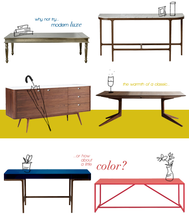
- I am OBSESSED with this collection.

- A useful roundup of tips for bloggers.

- There's more than one way to do this. Forty ways apparently.

- I've never tried cooking eggs this way, but there's a first time for everything.

- Finally, and this one's kinda just for me, but hello there. Watcha' working on? And why so buff?

Pink Friday


I'm presenting you with a little neon pink high-low shopping action today, because I just bought one of the items above and below. And to save you from the guessing game, I opted for the "low" version, but folks with a more padded budget might enjoy the "high." I'm talking of course about these spring scarves: one is from LemLem, the other from Target (I know, right?). While there are some physical differences (the LemLem scarf is actually two scarves sewn together, with a split in the middle where your head would go; the Target scarf seems bluer in tone), I assure you they're both pretty awesome (and crazy bright) scarves. They even both have those thin lines of neon orange flanking either side of all the neon pink stripes. Which one is right for you?


5.10.2012

Never enough doughnuts

While we're at it, is that how most of you spell it? Not donut? These are a couple of shots of Top Pot Doughnut's selection. One of my favorite treats, the doughnut (or donut).


(image via OneLovePhoto)

Hey Jude

...Stefano Agabio has a whole series of typographic posters based on the tune. Me likey. (via Abduzeedo)

5.09.2012

Ephemera Pt. 2


You know I love the original, but this new iteration on the series by Alberto Seveso, called a Due Colori, is so beautiful it's giving me heart palpitations. The high-speed photographs of ink mixing in water, this time with two dueling colors instead of one, are another hit for the Italian photographer and graphic designer. They remind me so much of the blanket octopus (google it, it's a stunning animal), with their organic, unpredictable dance.


5.08.2012

Lifes of Grass


A little Whitman + a touch of Mad Men's opening credit's and you've got Mathilde Roussel's metaphor for life and the effects of time on the body, Lifes of Grass.

5.07.2012

Odds & Ends

Just a random collection of bits and bobs. Who says everything has to be cohesive all the time? Links below.


one / two / three / four / five / six

5.04.2012

Weekender

Aww, how do you like my little schnookums up there? How many dogs do you know that smile? This pleasant weather sure is something to smile about. After the great meltdown those few weeks in March, it got cold again. Not terrible, but definitely not as good as it is now. 72 degrees. How do you Californians do it? Going to the city with a friend tomorrow. Maybe do a little shopping (why isn't there a Zara in the suburbs?), a little cream-puff eating.

Have a great weekend. Some links:

- Typography lovers, you really must play this game.

- Chocolate hazelnut mini pies. Mm-hmm.

- Geography isn't just for people anymore.

- Great house. Terrifying bathroom.

- Keep it simple.

- I'm at that weird stage after a haircut where you wish you didn't cut it even though it was so damaged. But at least it's now as shiny as this.

- She will literally stand on anything.

- Too cute for words. Found this on A Cup of Jo's roundup.

Pink Friday

This original salmon Eames rocker, a first-year Herman Miller distribution, is being sold by Cast & Crew on Etsy. A rare gem to brighten your day. Happy Friday, guys. 

5.03.2012

These Days

I came across these typographic artworks by Marisa Passos yesterday, and it reminded me of warm spring days (much like this one) spent strolling through downtown Chicago, a city I love so much.


5.02.2012

Avalanche Print


Check out these silk-screen printed totes and notebooks from Avalanche Print, a new project from Say What Studio. The prints are really different from many I've seen out there; they've got a bit of an edge to them that I love. They've got some deals if you want to buy more than one tote or notebook, or even a combination of both. They also have various screen-print color options, including gold, if you're feeling snappy :) . I actually included a link to the site in last week's Weekender, because I just loved the photography on their home page (shown above and way below). Such simple, but effective styling!


Related Posts Plugin for WordPress, Blogger...